Perform a principal component analysis (PCA) and plot PCs
Usage
pca_plot(
  se,
  PCs = c(1, 2),
  ntop = 500,
  color_by = NULL,
  shape_by = NULL,
  add_mean = FALSE,
  palette = NULL
)
Arguments
- se
A
SummarizedExperimentobject with a count matrix and sample metadata.- PCs
Numeric vector indicating which principal components to show in the x-axis and y-axis, respectively. Default:
c(1,2).- ntop
Numeric indicating the number of top genes with the highest variances to use for the PCA. Default: 500.
- color_by
Character with the name of the column in
colData(se)to use to group samples by color. Default: NULL.- shape_by
Character with the name of the column in
colData(se)to use to group samples by shape. Default: NULL.- add_mean
Logical indicating whether to add a diamond symbol with the mean value for each level of the variable indicated in color_by. Default: FALSE
- palette
Character vector with colors to use for each level of the variable indicated in color_by. If NULL, a default color palette will be used.
Value
A ggplot object with a PCA plot showing 2 principal components in each axis along with their % of variance explained.
Examples
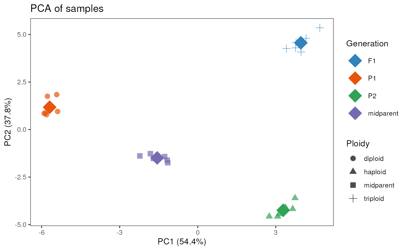
data(se_chlamy)
se <- add_midparent_expression(se_chlamy)
se$Ploidy[is.na(se$Ploidy)] <- "midparent"
se$Generation[is.na(se$Generation)] <- "midparent"
pca_plot(se, color_by = "Generation", shape_by = "Ploidy", add_mean = TRUE)
#> converting counts to integer mode